Zig

Information
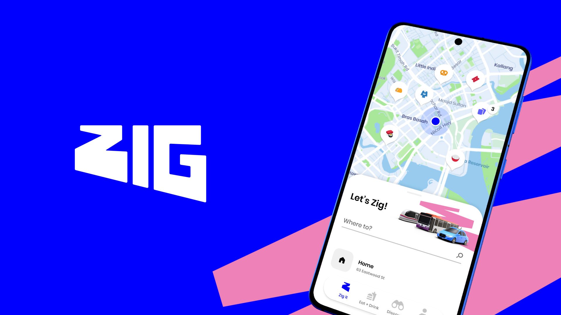
Zig is an app that brings Singaporeans a new way to move. Designed & built within 6 months, it helps you get around the island and inspires you with new places to eat, drink and discover.
I led motion design for Zig, working closely with the brand, UI and dev teams at R/GA.
Bringing Zig to life
Motion was considered from the very beginning, as a way to connect new users with the mission of Zig.
As we combine fun experiences with everyday journey planning, it became clear that we needed two styles of motion in the app.
Get me there fast
This style of motion aims to moves you through the app. It's fast, fluid and and gives a user spatial context as to where they are. This is subtle, but critical to make the app feel responsive.
For example, the Journey Planner feature is something you'll use multiple times a day, so it needs to be fast to use.
We also focused on using this principle to improve the UX, helping users complete tasks.
Subtle animation also helps draw attention to live and updated information. This is important for ongoing journeys, as things can often change at a moment's notice.
Get me excited
With this principle, we bring a sense of playfulness - creating moments of expression and delight. We use it as an opportunity to surprise and engage the user, creating a deeper connection with Zig.
This often involves more complex, choreographed animation. I designed these sequences in After Effects and delivered them to developers using Flare and Lottie for direct implementation.
From concept to build
I worked closely with the development team, presenting interaction concepts and working collaboratively to refine them in a way that could be implemented.
As Zig is one of the most complex apps built on the Flutter development platform, performance was key. We developed many solutions to get our custom motion design across each component with the least performance impact.
Microinteractions were documented with clear motion specs. I created custom easing curves that were used consistently throughout the app, simplifying development and further integrating the motion language.
Defining the brand
I was tasked with defining how the design system works across all touchpoints.
To celebrate the launch, I also created a case study video that put the brand in motion. Here, we lean in to the boldness of the brand - using playful movement and colour to excite people about the new venture.
More than just motion
I played a big part in developing the Figma design system. I refined designs into flexible components and variants, ensuring consistency throughout the UI.
With my previous experience in cross-platform UI design, I was responsible for validating designs across iOS and Android, ensuring that interactions felt native for each platform.
I also helped to design Zig's unique map style, creating a vibrant look that stands out among competitors.
A successful launch
It's almost impossible to believe that this was all designed and executed within 6 months. It's a true testament to the talent and leadership at R/GA!
The app launched to 5-star reviews across both app stores, successfully launching a new category - merging lifestyle and transport into one singular destination.
Credits
-
Studio
- R/GA Singapore
-
UI Design
- Aron Mayo
- Sharmila Roseli
- Sam Mularczyk
-
Motion Design
- Sam Mularczyk
Back to menu