Spotify for Artists
Information
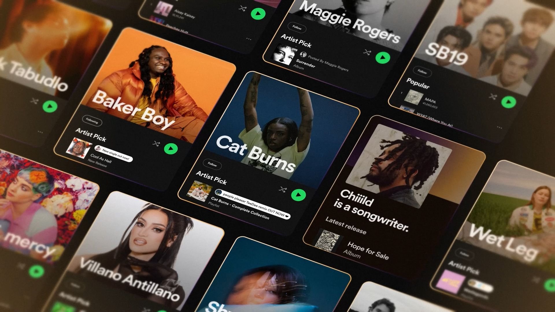
Spotify for Artists helps musicians learn more about their audience. Bokeh developed the script, strategy and creative approach for a video to premiere at Spotify's Stream On event.
I was brought on as the visual designer, defining the style and creating the storyboards from start to finish.
Evolving the design
Bokeh had made a previous spot that everyone (including me!) really liked. The question was: how can we follow that up and evolve the Spotify for Artists brand?
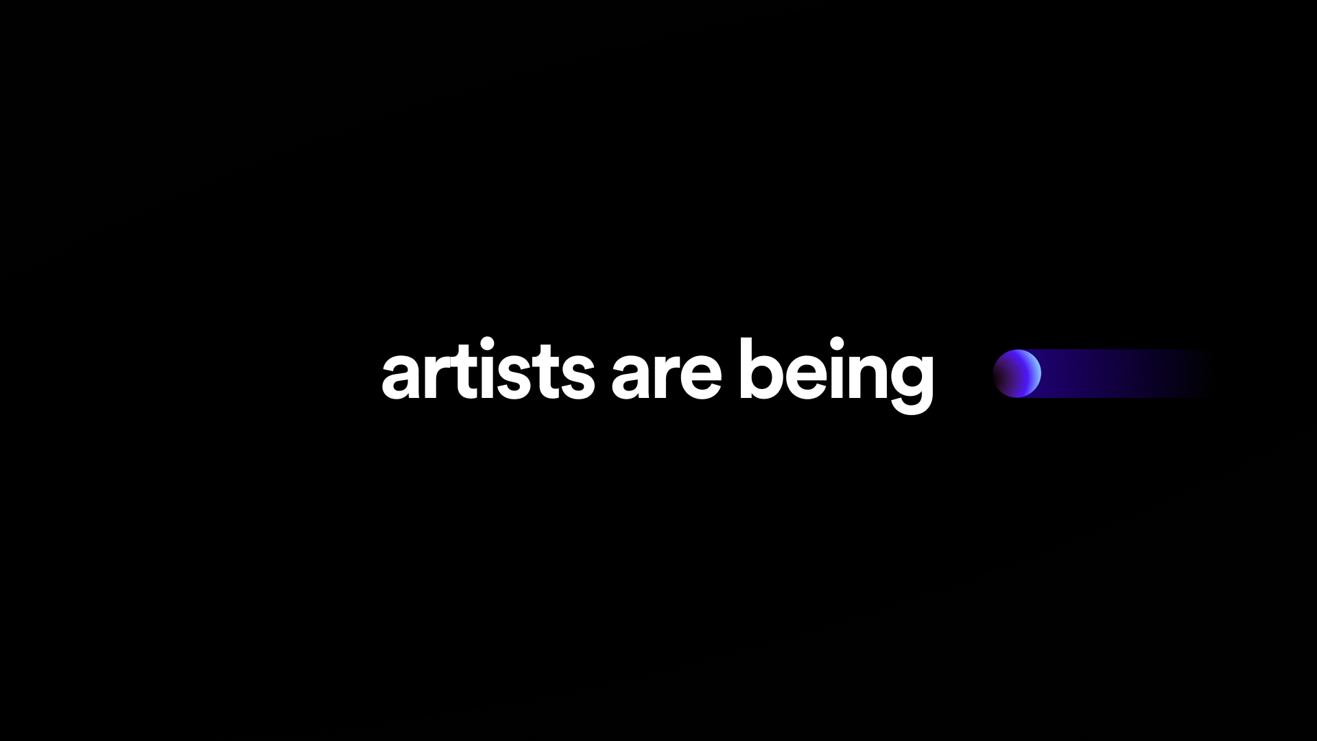
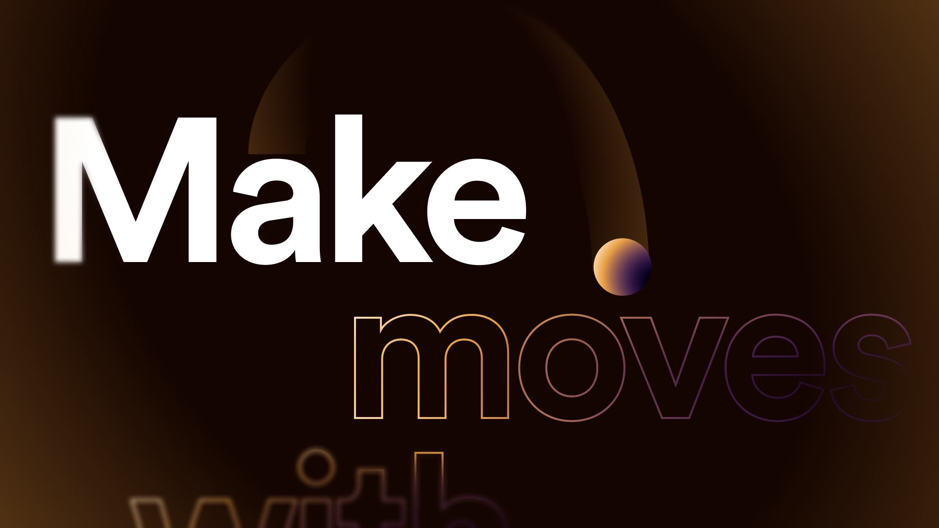
We turned their primary brand colours into gradients and used these as accents for each section, combining them with an almost tilt-shift style blur. The goal was to create a feeling of depth without positioning everything in 3D space.

Designing in Figma
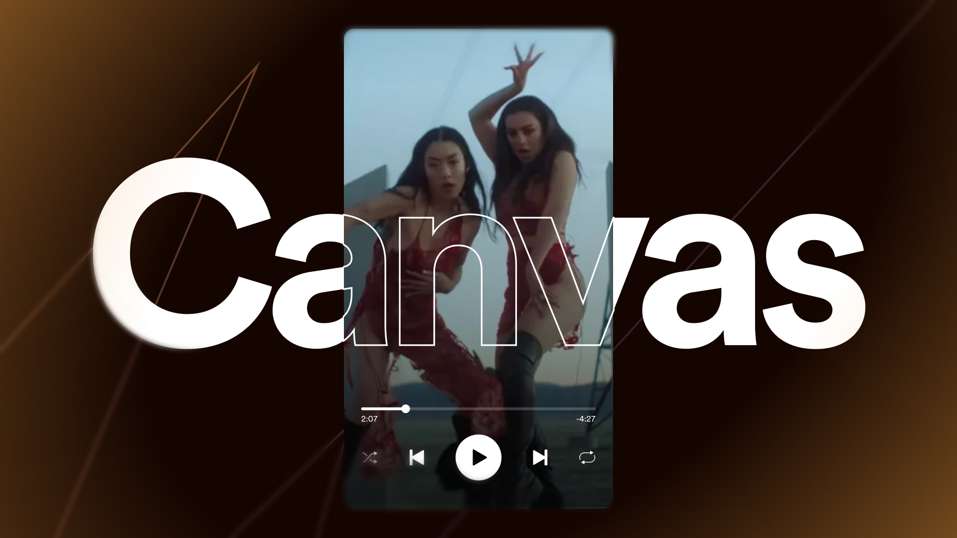
Spotify's UI features heavily in this film, so we chose to design entirely in Figma. This made for fast iteration and a simple feedback process.
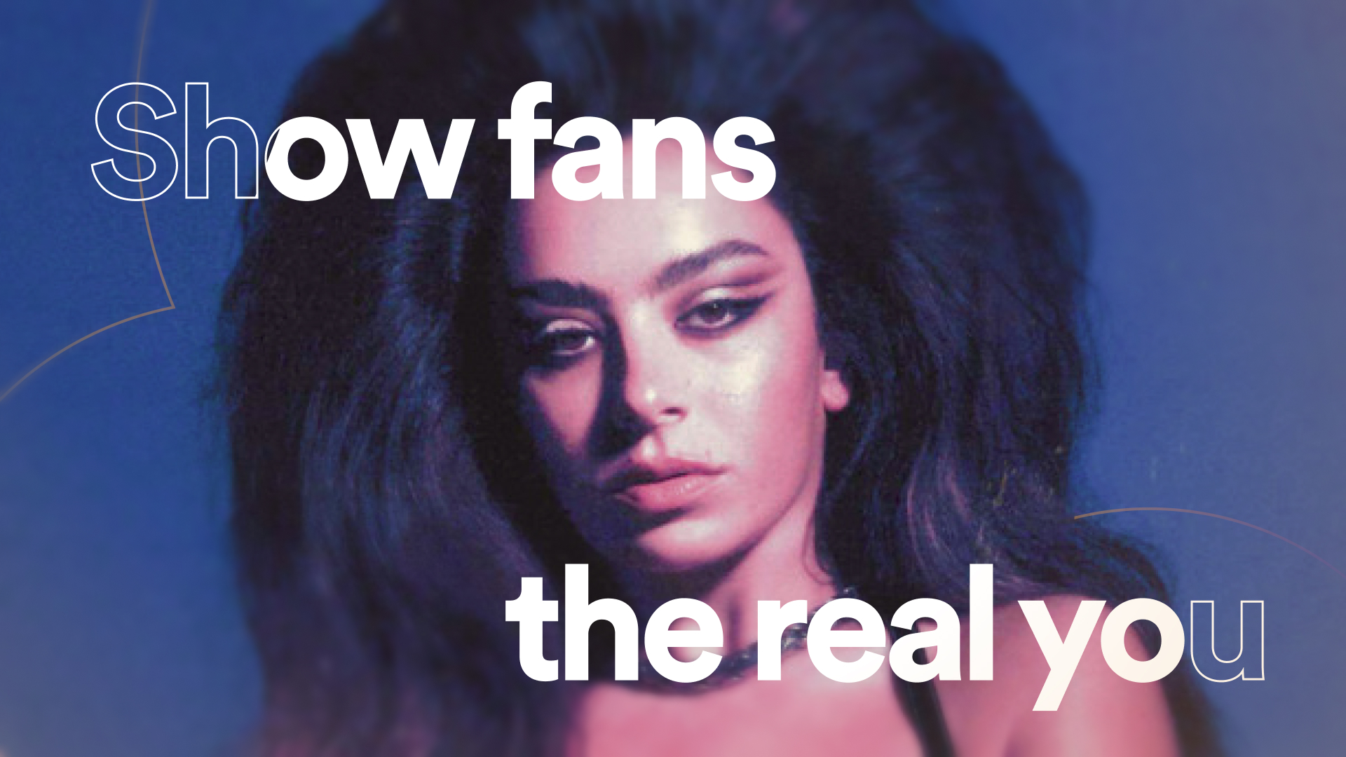
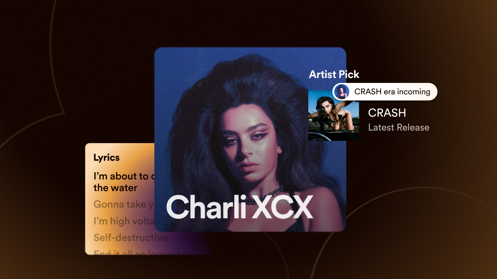
I really enjoyed the process of simplifying the UI to its essentials, keeping it recognisable but evolving it for more visual impact.
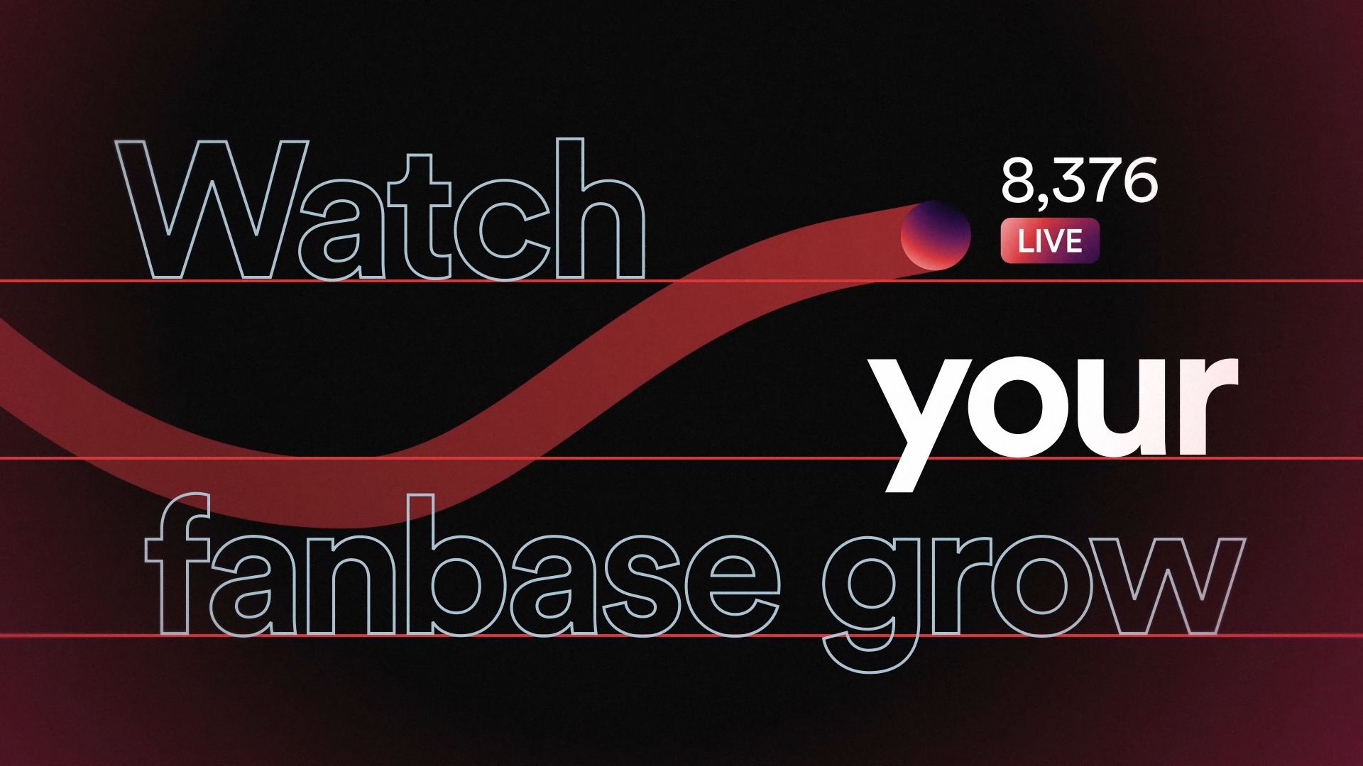
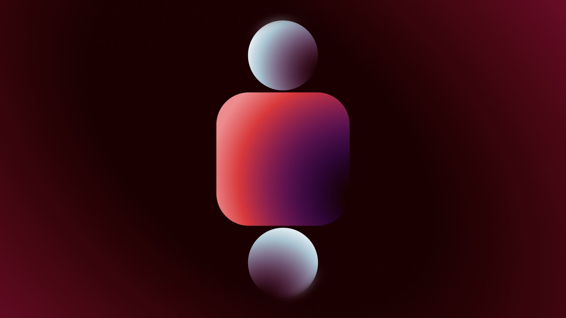
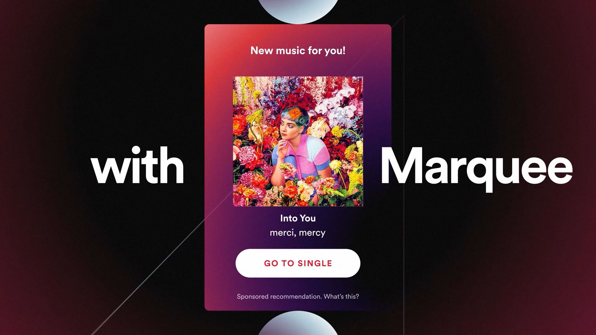
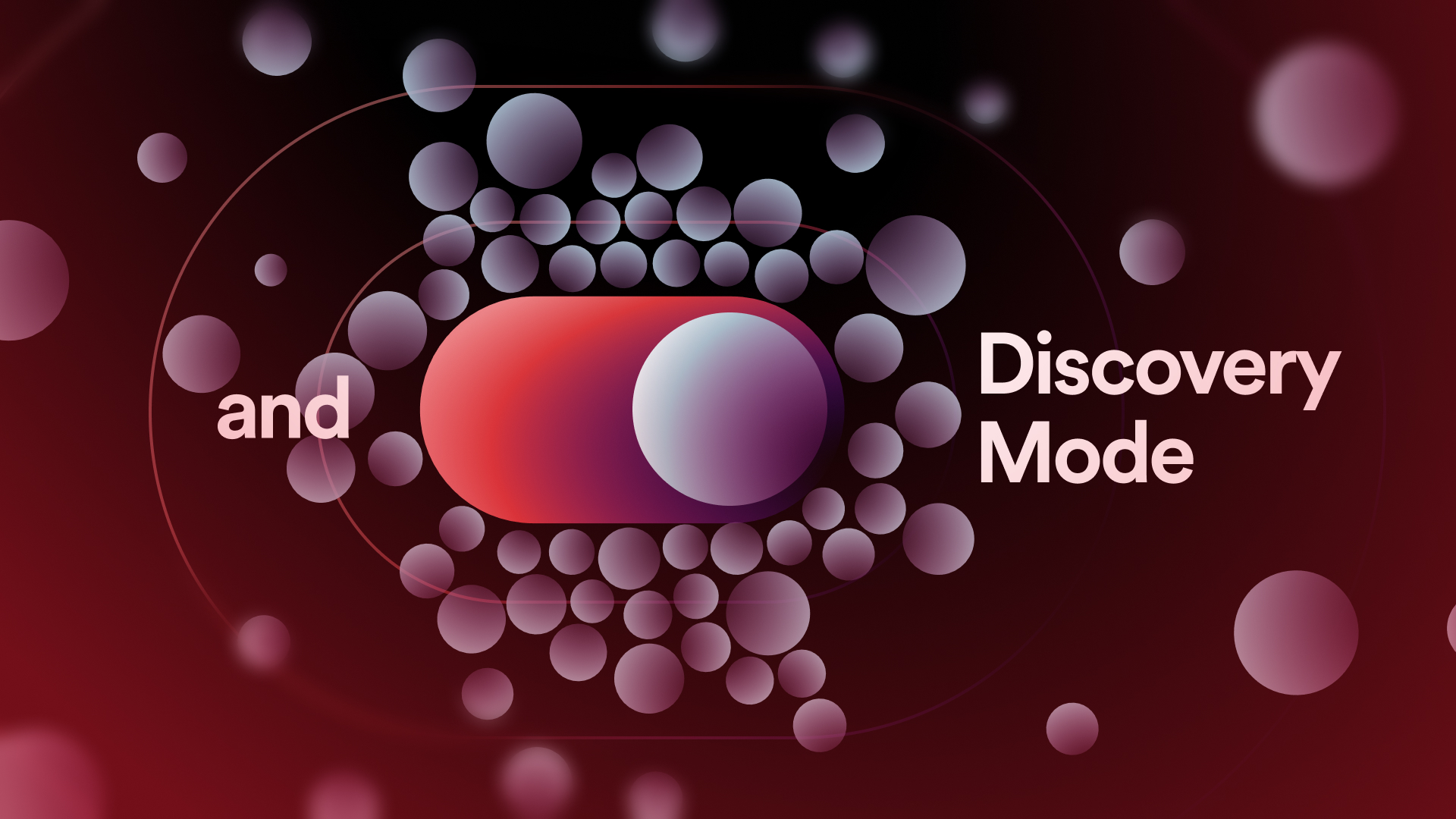
Frames were transferred to After Effects using AEUX: a tool mostly used for UI flows, but I was impressed with how well it worked with more complex art and effects.
Collaboration is key
The team at Bokeh were incredibly generous and supportive. We'd chat every day and work together on potential ways to improve the flow of the video, making small changes to the script where necessary. Their direction was critical!

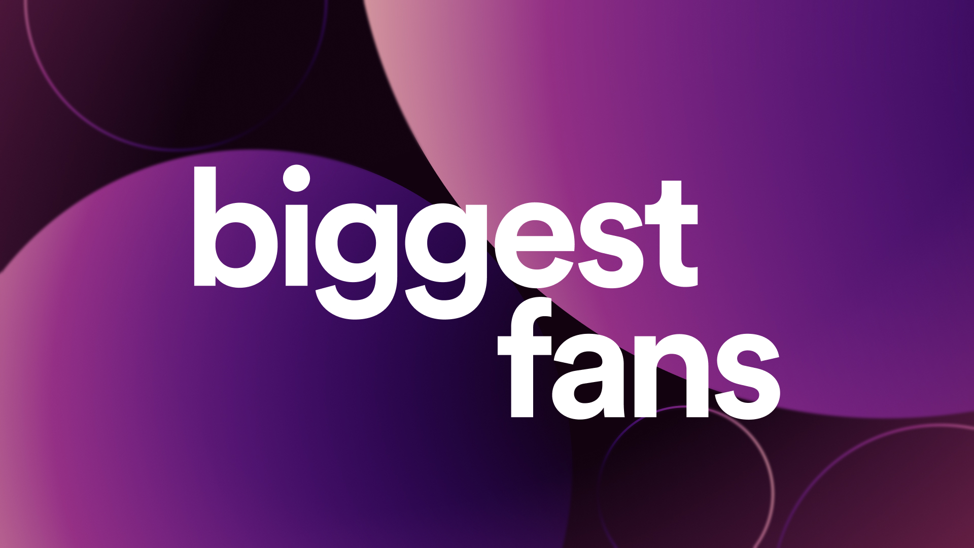

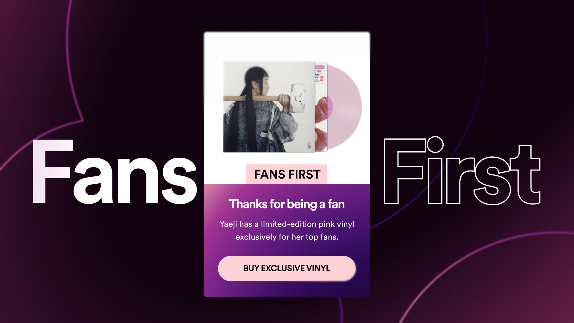
While I didn't touch After Effects, I felt my experience as an animator sped up the design process, and made hand-off easier. I included notes and storyboards for key transitions, and provided animation direction midway through the production process.
The final film
Often I end up animating the projects I design. So it was a rare treat to have Bokeh's animator, Charlie, take these boards and bring them to life - and I couldn't be happier with the result!
Grateful to the team for bringing me on board and for their collaborative approach.
Credits
-
Studio
-
Direction
- Doug Smith
- Sebastian Camard
-
Design
- Sam Mularczyk
-
Animation
- Charlie Smith
Back to menu