Canva Create: Work Redesigned
Information
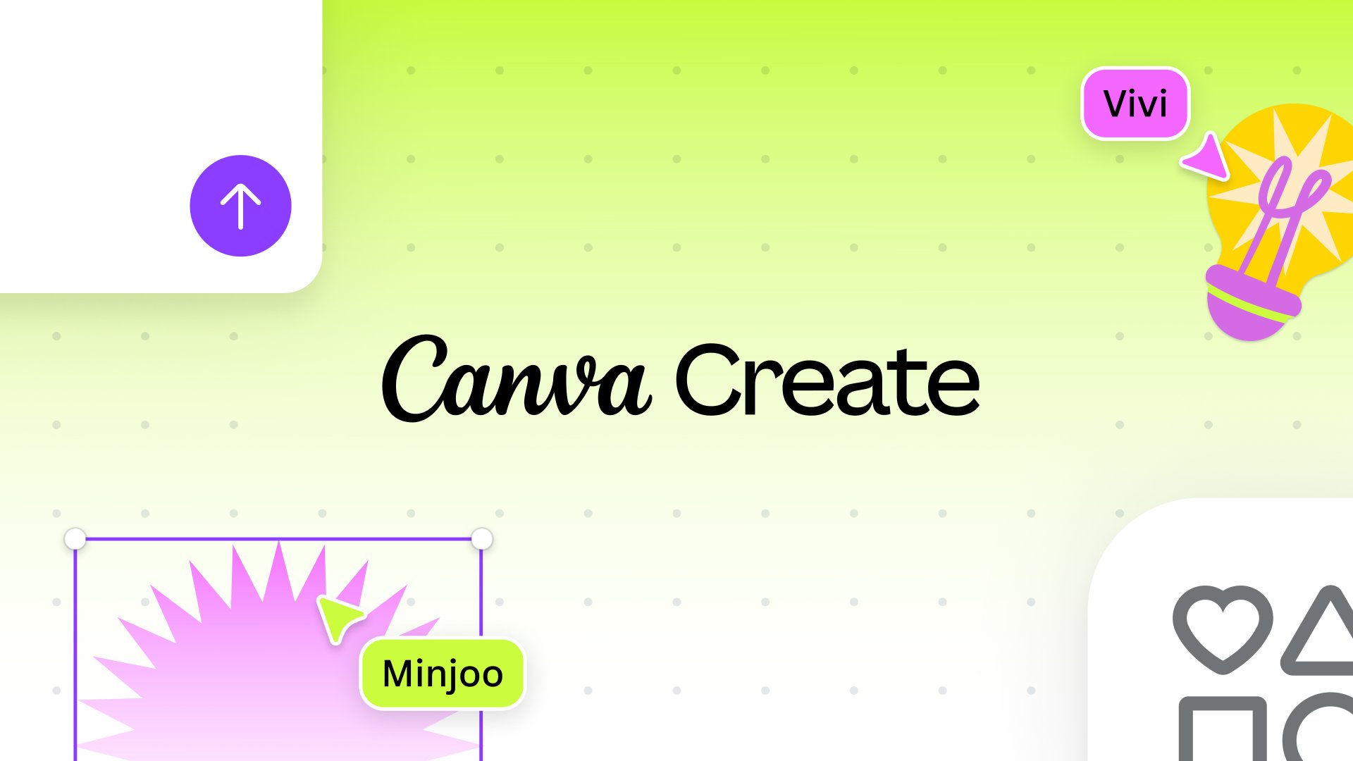
Canva Create is an annual celebration of creativity, showcasing the latest announcements and innovations from Canva. It was their biggest event yet, with 4 stages, 2000+ in-person attendees and some very special guest speakers.
In 2024, the theme was Work Redesigned. I was brought on board for the second year in a row. Working within the incredible Canva brand and motion team, we developed content and designs to be rolled out across the event.
Here's a few things I was lucky to play a role in.
Setting the stage
The team developed a robust brand toolkit for the event. They wanted each stage to have its own distinct identity, within the bounds of this system.
I was tasked with concepting, designing and animating the intro videos for each stage, under the creative direction of Canva's brand team. I sketched and storyboarded each intro, diving into the keyframes once approved.
Create Stage
The flagship stage of Canva Create, with content flowing across three huge LED screens. This intro leans into the design and layout features of Canva, bringing together multiple types of content on a single canvas.
Design and Innovation Stage
Sessions discussing the latest innovations and breakthroughs in the design space. This concept is inspired by the idea that multiple objects can be brought together, adjusted and transformed to create something completely new.
Canva For You Stage
The For You stage hosts speakers discussing their workflow and how they create design for impact. For this intro, I chose to highlight Canva's collaboration and communication tools, focusing on the idea that working together creates a better outcome.
Canva Learning Studio
Here, Canva experts guide attendees through hands-on workshops, showing off the many new features. Closeups of the brand new Canva UI with multiple participants create a more technical feel, inspired by tutorials and Canva Whiteboards.
Templating
We had more than 20 different talks across the 5 stages, with different titles and speakers. Any big event is a fast moving process, so being able to make quick updates is critical.
I built a dynamic template that references a spreadsheet. The template automatically grabs each talk's title, session number, speaker name and byline. This allowed the production team to adjust information quickly, and reduced the risk of typos or incorrect information in the final exports.
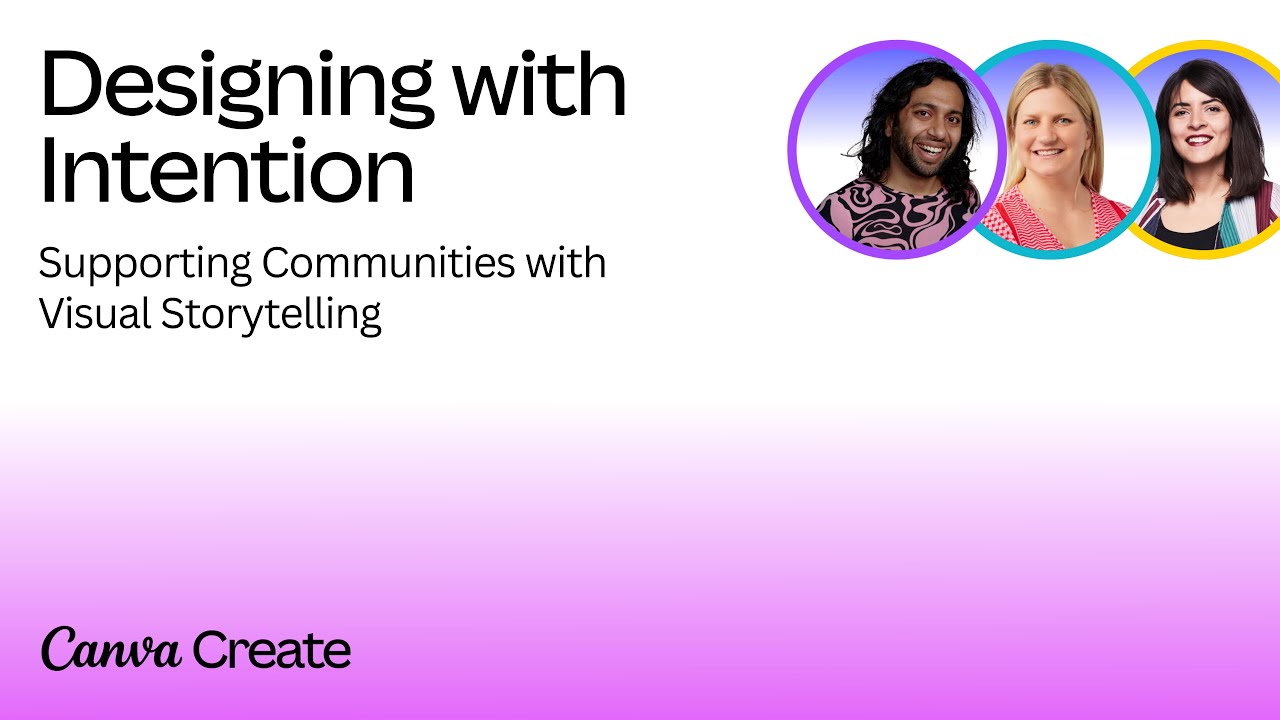
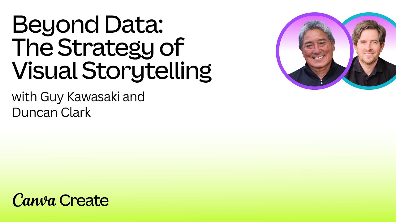
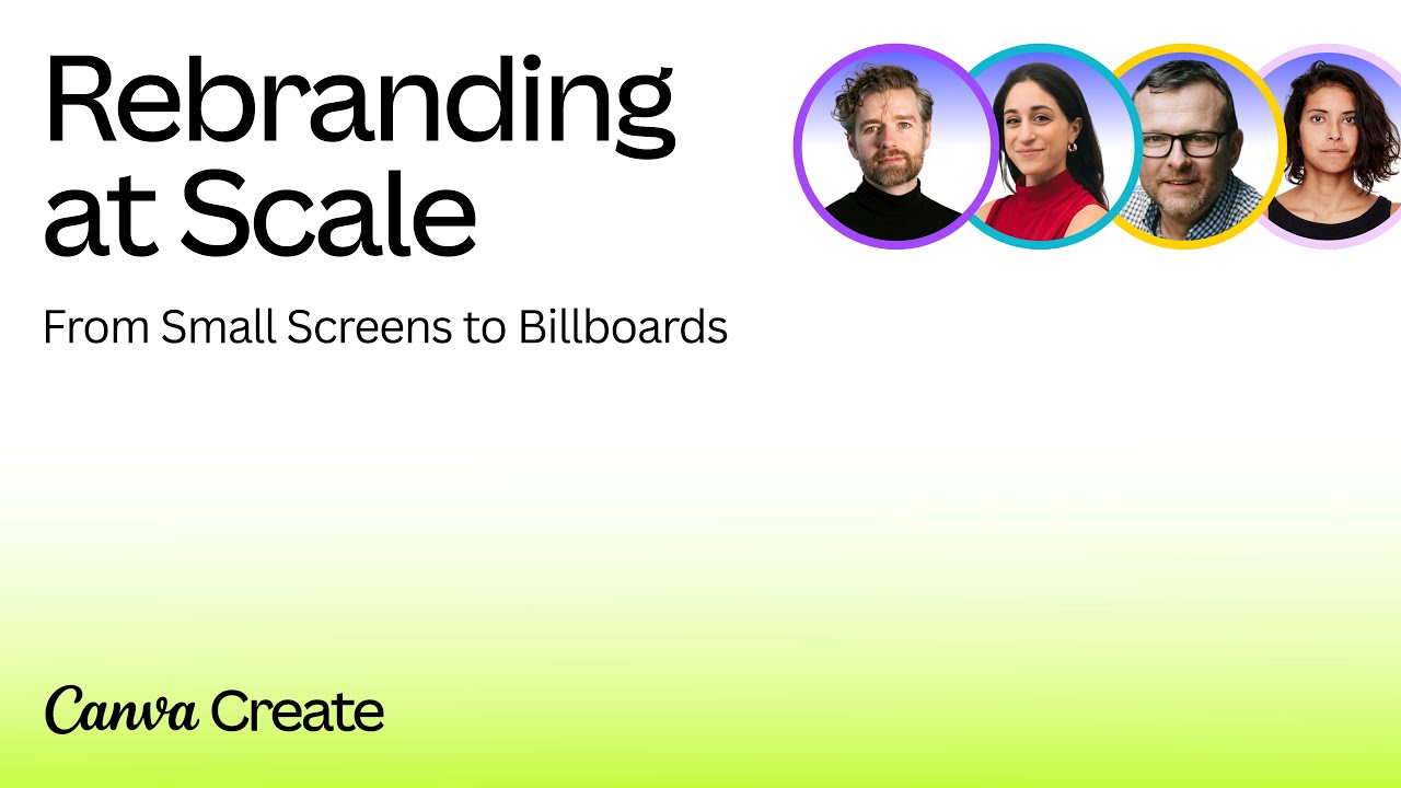
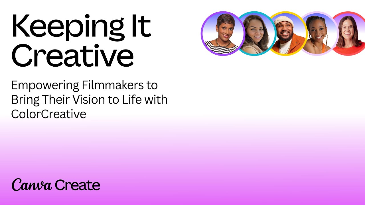
I stress-tested the template to ensure it could handle all situations. The layout flexes based on the length of text, and the animation adjusts automatically based on the amount of speakers!
Bringing life to the cursor
The cursor is a core part of Canva's identity. Previously, adjusting the angle of the cursor required manual animation. For the stage intros, we wanted the cursors to be even more expressive.
I reworked the cursor, with a template that now allows you to adjust the angle with a single control. I also added the ability to transition between cursor types. We ended up using this updated cursor across the whole event!
Polishing those 3D textures
The brand toolkit called for some 3D background loops. I worked with Canva's amazing Phillip Tibballs and Minjoo Shin, to build, light and texture three abstract 3D scenes. To ensure the widest flexibility, I added a procedural looping animation to each one. Plus, for those closeups, we can use our second set of textures that are upscaled to 8K.
A successful event
Canva Create was a huge success, and continues to grow year after year. I'm grateful to be a part of it and can't emphasise enough how talented the in-house team is. It was a true collaborative effort, and their feedback and input is essential!
Want more? Check out Canva's full case study at canvacreative.team
Back to menu